Brand Colours on the Wall: Matching Artwork to Your Corporate Identity
Your logo, website and stationery are carefully controlled. Then a client walks into your office and sees a wall of mismatched frames. It's an easy gap to close, and art is a good way to do it.
The aim isn't to repeat your brand colours everywhere. It is to make the space feel like it belongs to the same company as your website and your documents.
Start with your palette, not your logo
Open your brand guidelines and pick out the main colours: usually one or two dominant shades and an accent. Those are what you will look for in artwork. Your logo itself doesn't belong on the wall. A picture that echoes a colour you use is far more convincing than one that shouts about it.
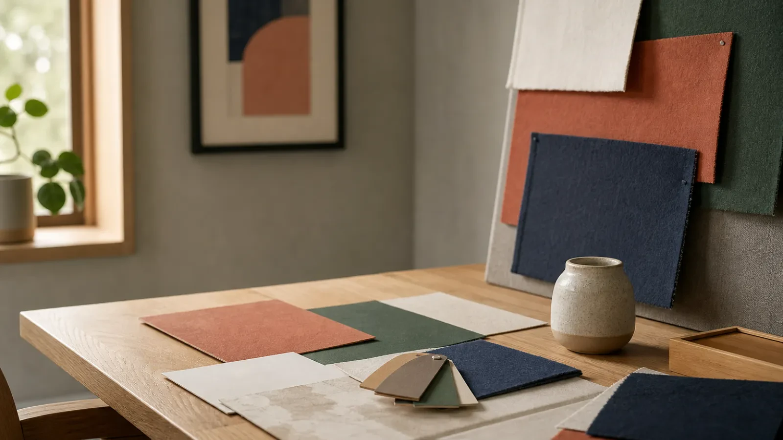
Be realistic about what a standard collection can do. We can't match a specific colour reference, so look for art that sits in the same family and works well with your palette, not an exact shade. You can browse by colour family, such as cobalt or sage, and compare how different pieces sit alongside your own materials.
Pick a style that suits the business
The colour comes from your brand, but the style should come from how you work.
- Law, finance and consultancy: Minimalist or restrained Abstract work, with your accent colour as a small lift.
- Creative and design studios: bolder Abstract pieces or Graphic & Geometric compositions that play with contrast.
- Hospitality and client-facing rooms: warmer, softer pieces, such as Landscapes & Nature in colours that sit gently beside your brand. Our art for hospitality venues page is a good place to start.
- Technology: crisp Graphic & Geometric pieces with plenty of structure.
Balance the loud and the quiet
Not every wall needs to be in your brand colours. A mix works better.
- Use one larger piece in or near your main colour as the statement.
- Let smaller pieces pick up an accent, perhaps just a thin line or a corner of colour.
- Keep the rest in neutrals such as stone or ivory, so your colour has room to stand out.
A good test is to stand at the door and squint. If your brand colour appears two or three times, evenly spread, the room is balanced. If it is everywhere, it will feel heavy.
Choose where the colour goes
Put your strongest pieces where people spend their first minutes: reception and the main meeting room. Quieter, more varied pieces suit corridors, kitchens and breakout areas, where a little variety is welcome. Keep frames consistent across a floor, because matching frames pull a mixed set of images together.
Mind the surroundings
Colour changes with light and with what's beside it. A blue that looks right on screen can feel colder against grey carpet or cooler daylight. If you can, hold a sample of your paint, carpet or furniture up to the screen, and think about how daylight in your actual room will change it. If you are unsure, get in touch through our contact page and we will happily talk it through by email or phone.
Update as you go
Brands change, and so do offices. If you refresh your colours later, you can replace a handful of pieces without redoing the whole room. Keep a note of what hangs where, so a future change is a quick job.
Next steps
Start with one room and one colour. Look at the business and commercial collection, choose a main piece and build around it. For a larger scheme across several rooms, our trade service is set up for multi-piece projects.