Preview site Orders won’t be printed yet. We aren’t taking live orders yet. Browse the full collection, but any order placed here is a test and won’t be printed.
Abstract Wall Art
A sweep of colour, an unexpected shape, a mark you keep coming back to. Abstract art leaves room for your own reading, whether you are drawn to broad, expressive compositions or something quieter.
Framed from £39.95
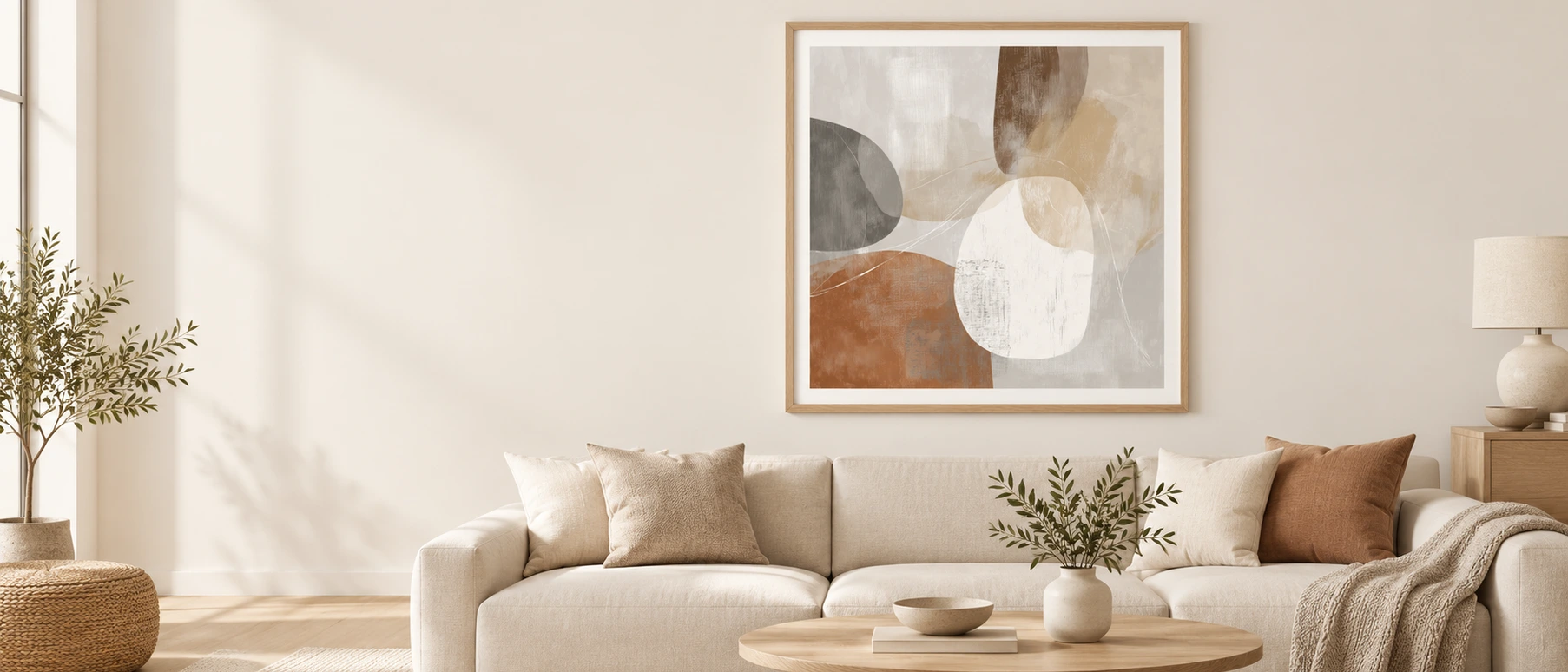
A closer look
-
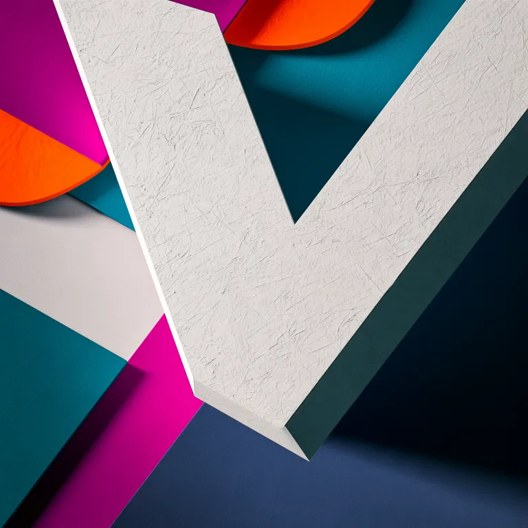 Monumental V
 -
 Retro Rainbow Arch
 -
 Yellow Lace Tag
 -
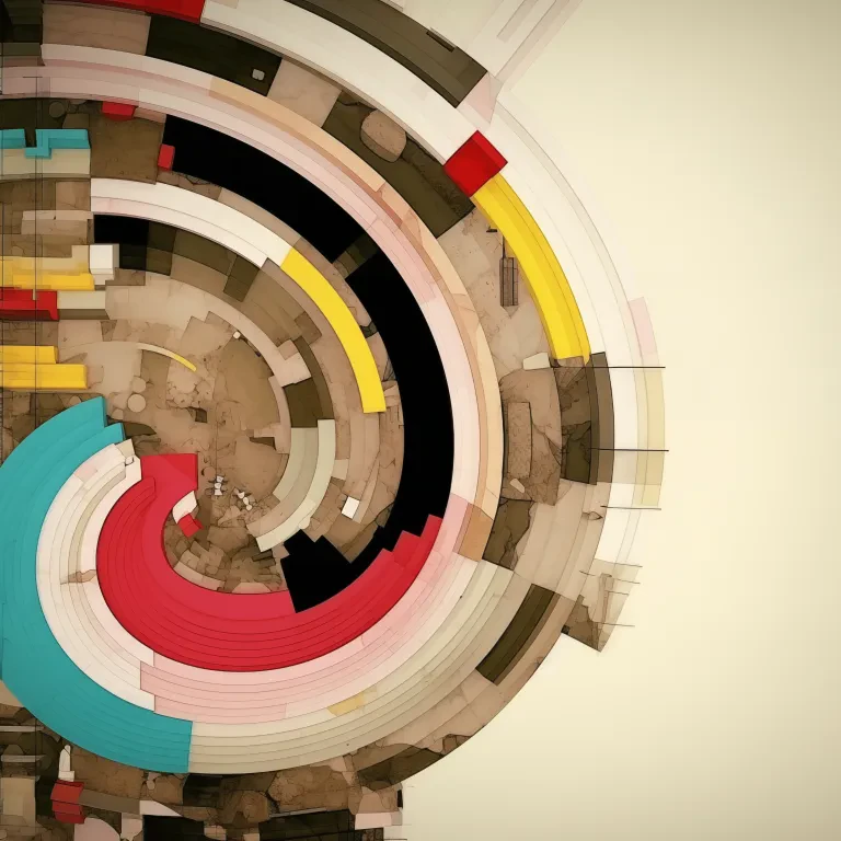 Spiral Archive
 -
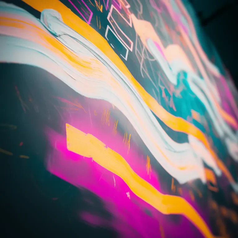 Graffiti Slipstream
 -
 Chalkboard Meteor
 -
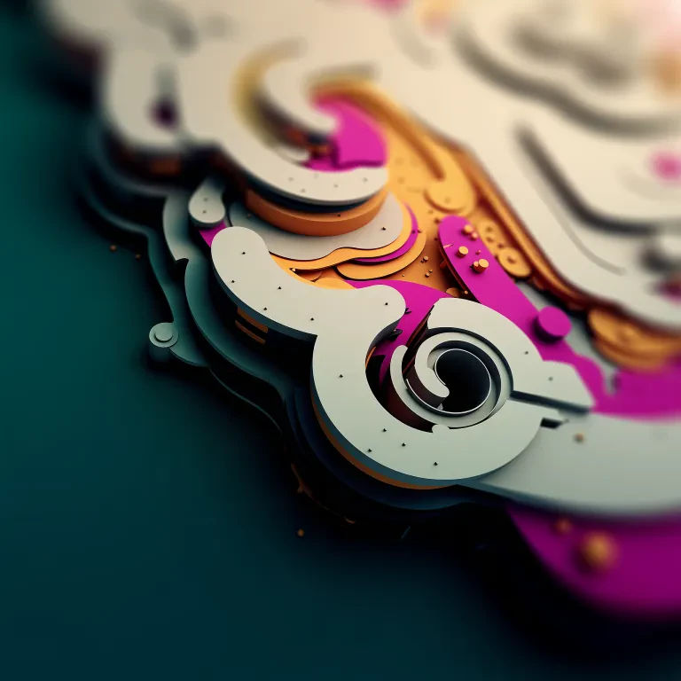 Paper Clockwork
 -
 Coral Blossoming in Dark
 -
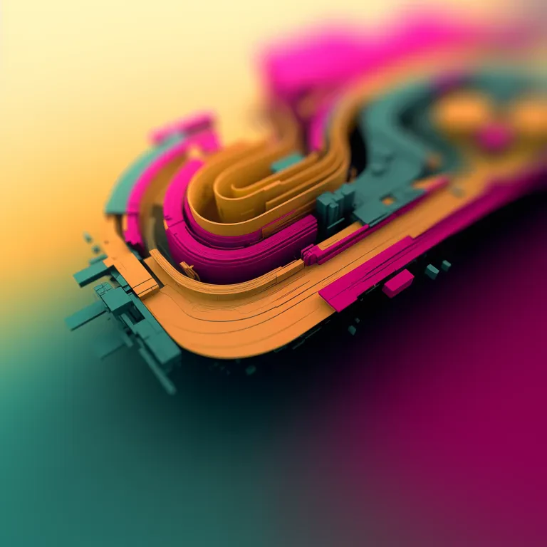 Turntable Terrain
 -
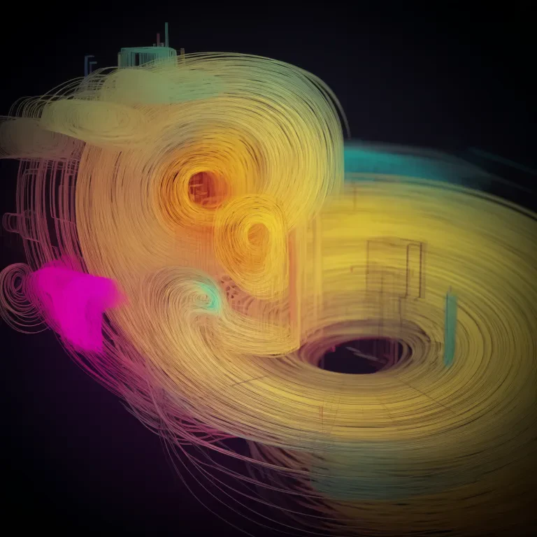 Golden Whirl
 -
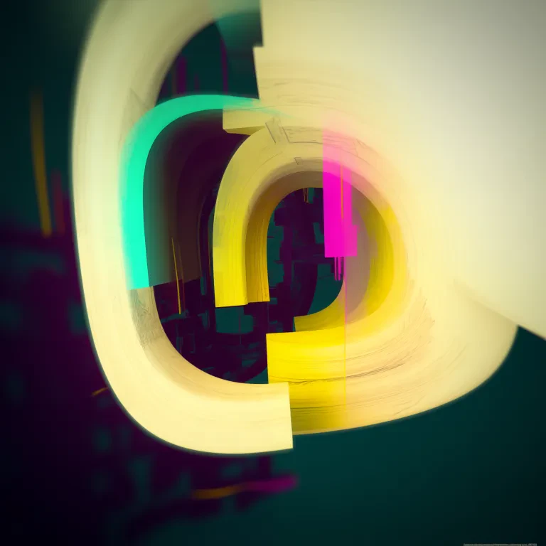 Glowing Letterform
 -
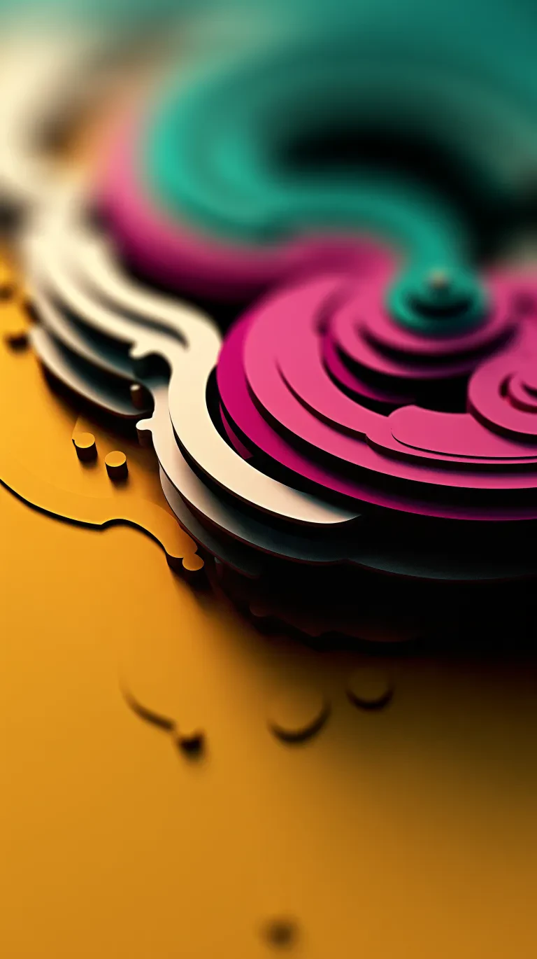 Ochre Spill and Ripple
 -
 Rose to Teal Drift
 -
 Candyfloss Whirlwind
 -
 Night Train Bokeh
 -
 Orbits in Pen
 -
 Street-Map Seated
 -
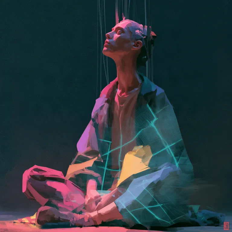 Marionette Meditation
 -
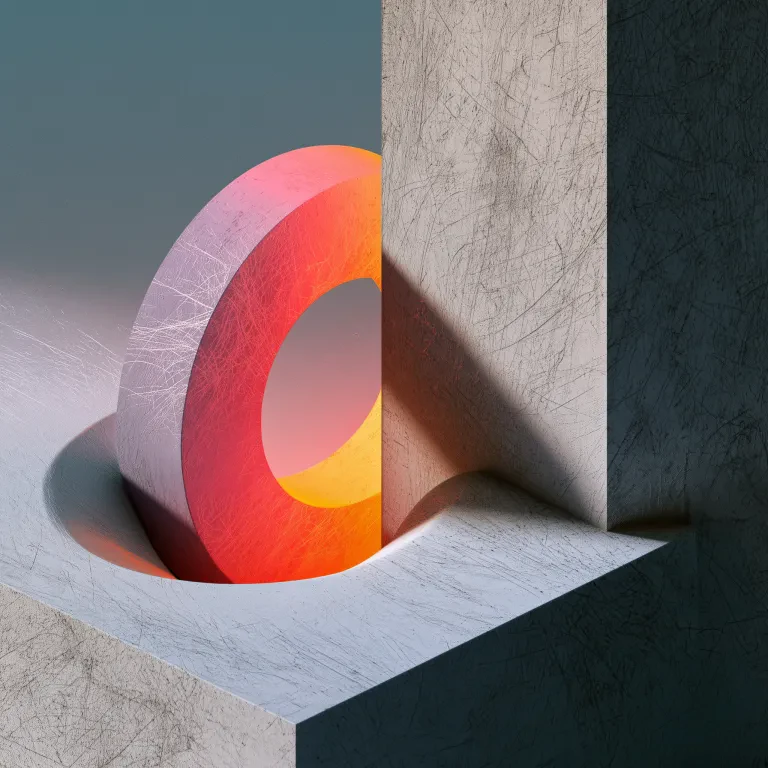 Ring in the Trough
 -
 Ribbon Canyon
 -
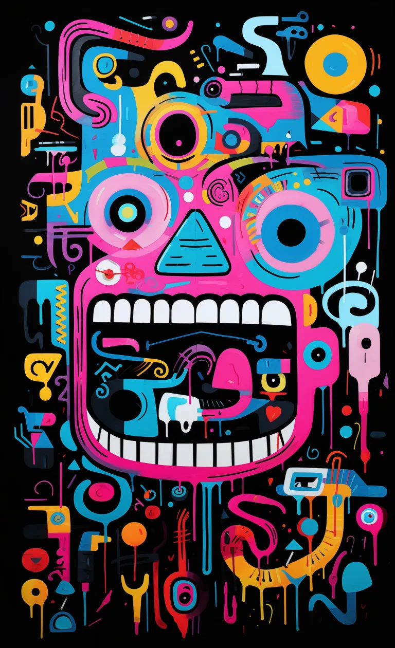 Grinning Totem
 -
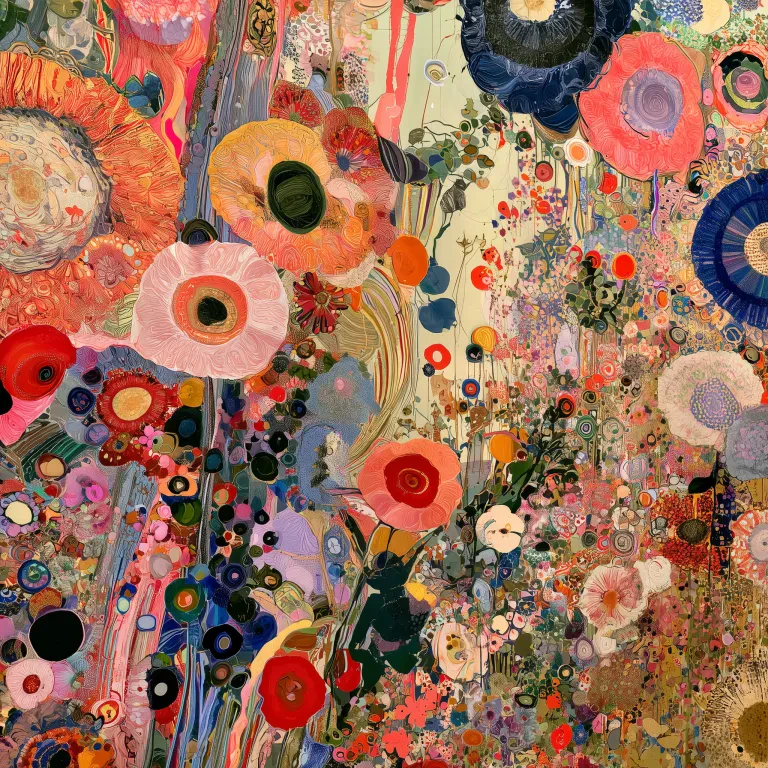 Meadow Confetti
 -
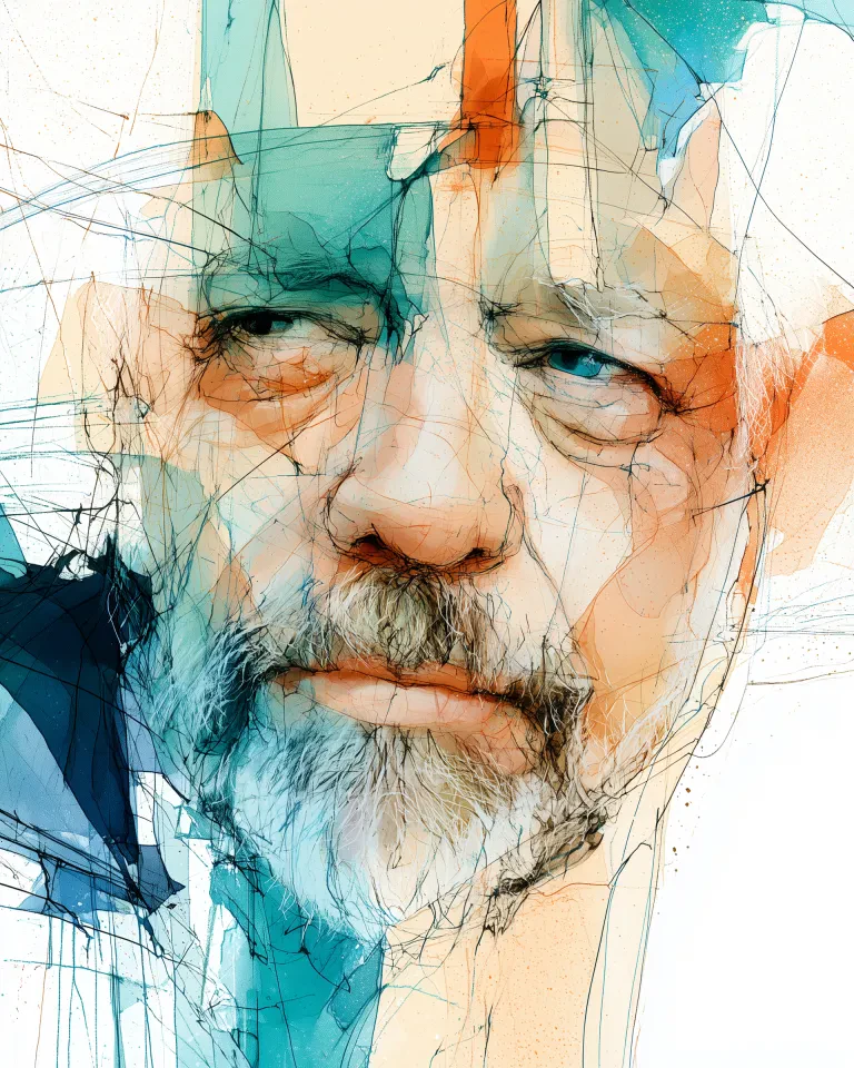 The Sceptic
 -
 Banked Turn
More about Abstract
Colour without a script
Notice how your eye moves through the picture. Closely spaced marks can make a composition feel busy; broad areas of colour give you somewhere to pause. There is no need to explain your choice beyond enjoying what you see.
Make room for it
Try a broad composition above a sofa, a tall piece beside a doorway, or a quiet study near your desk. The mood comes from the particular artwork, not the theme alone. Our living room guide and interior design tips can help you place it.
Pick up a colour
Look for a smaller colour in the artwork that could echo a cushion or a favourite ceramic. Ochre, terracotta and umber bring earthy warmth; teal, indigo and sage offer cooler notes. For a quieter palette, explore stone, ivory and charcoal.
Try the size first
Above a sofa, around two thirds of its width is a useful starting point, not a rule. Mark out the framed size on your wall and look from your usual seat. Compare dimensions in the size guide or read our measuring guide.
Give each piece a neighbour
A shared colour or repeated shape can connect quite different artworks. Explore the other works shown in a set, then choose the ones you like together. Each print is bought individually, so you can begin with a pair or build up a wall over time.
Choose the surface
A framed print gives delicate marks a defined border. Stretched canvas adds visible texture; acrylic brings a gloss to stronger colours. Compare the materials and framing on our print formats page.
Choosing Abstract
What counts as abstract wall art?
Abstract art works with colour, shape and marks rather than a clearly recognisable scene. You can enjoy the balance or mood without finding a single meaning.
What colours go with abstract wall art?
Try echoing a smaller colour from the artwork in a cushion, throw or lamp. Matching its dominant colour is an option too, if you enjoy a coordinated room.
Does abstract art work in a bedroom?
Yes. Softer tones and open compositions are worth exploring for a quiet bedroom, but choose the artwork you find restful.
What size abstract print should I hang above a sofa?
Around two thirds of the sofa width is a useful starting point. Check the outer frame dimensions and try a paper outline on the wall before ordering.
Can I buy a set of three abstract prints?
You can choose three artworks from the same set. Open an artwork page to see its companions; each print is bought individually.
Should I choose portrait or landscape?
Start with the space available. A wide wall may suit landscape, a narrow gap may suit portrait, and a square can work well in a grouped arrangement.
Something else in mind?
Browse the whole collection by theme, colour or shape. Save anything you would like to look at again.
A little advice can help
Unsure about a size, a frame or which artwork to choose? Tell us what you are considering and we will help you weigh up the options.
-
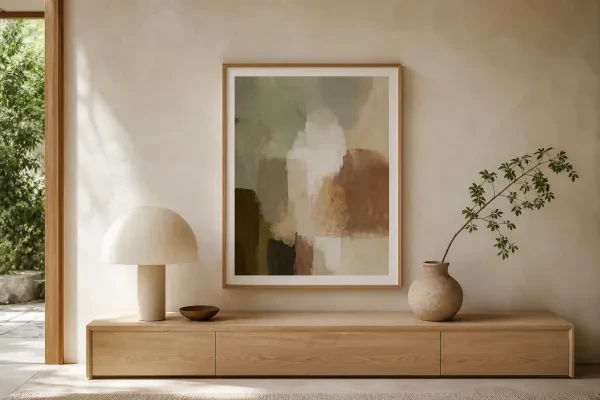
Find the right size
A tape measure and a paper outline can answer more than guesswork. Here is how to use them.
-

Art for your living room
Find a piece you want to live with, then make the size, colour and frame work with your room.
-
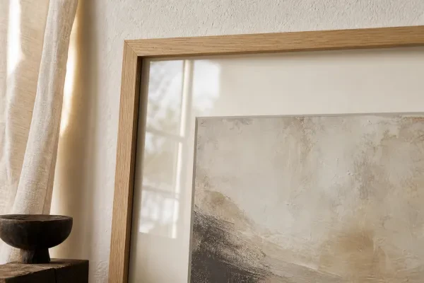
Choosing framed prints
A frame changes how an artwork sits on the wall. Find the colour and size that bring it together.