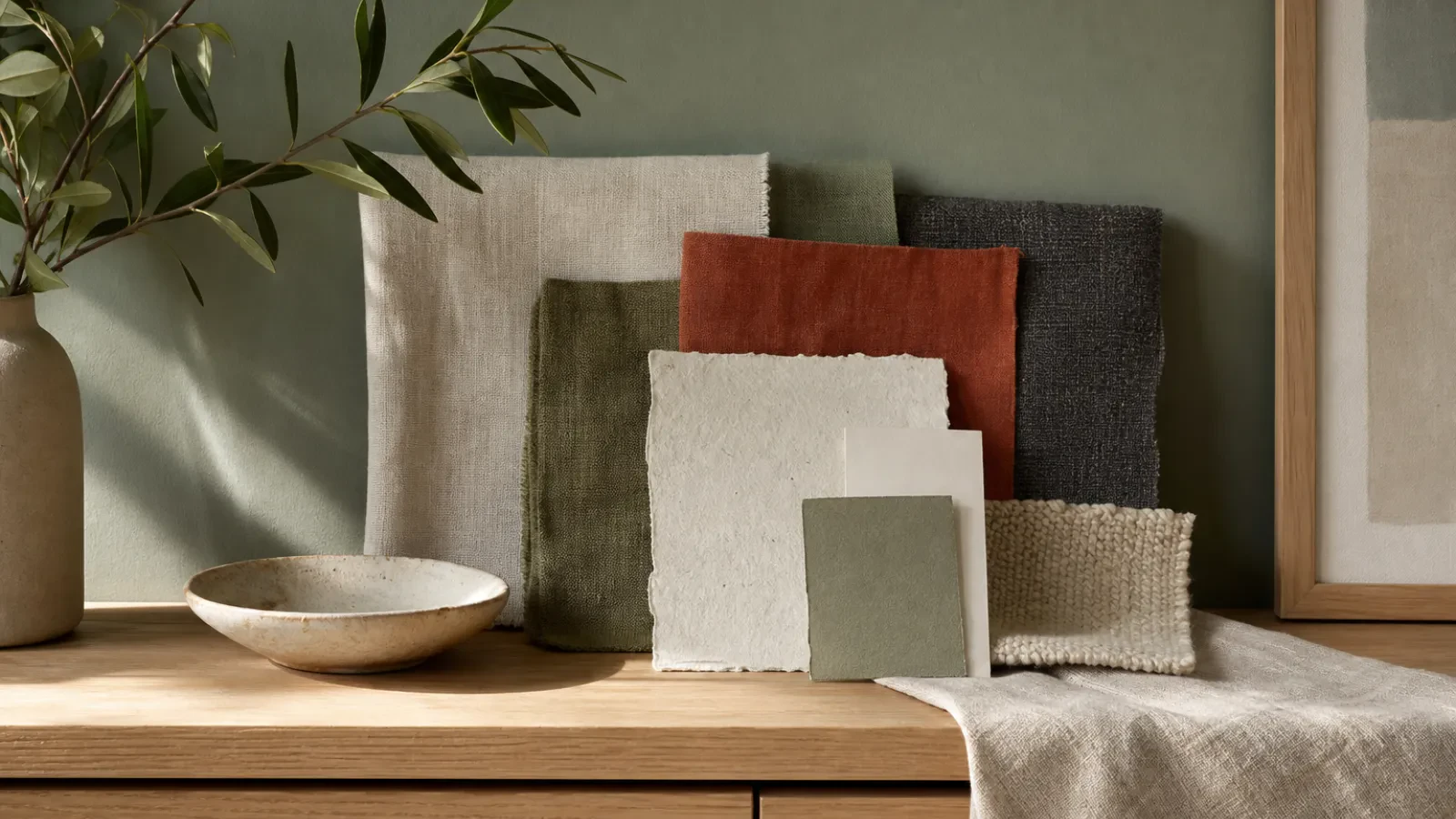
The Colour Match Guide: How to Choose Artwork That Suits Your Home
The artwork that looks right in a room is rarely the one that matches it exactly. It's the one that seems to have been waiting there. That feeling comes down to colour, and it's easier to get right than you might think.
You don't need to match your cushions. What you want is a conversation between the picture and the room, so that each makes the other look better.
Start with the room you have
Before you browse, spend a minute looking at the space. Which colours repeat? Perhaps it's the warm wood of the floor, the grey of the sofa and a rust-coloured throw. Those are your colour anchors, and two or three is plenty.
Then note the light. A north-facing room tends to look cooler and flatter, while a south-facing one runs warm and golden. The same artwork can feel quite different in each.
A quick tip: take a photo of the wall in daylight and keep it on your phone. It's a useful reminder when you're choosing.
Use the 60-30-10 idea
A common rule of thumb in interior design splits a room's colour into three parts: about 60 per cent main colour (walls and large furniture), 30 per cent secondary (rugs, curtains, smaller pieces) and 10 per cent accent.
Art can sit in any of those zones, but it's most often your accent. A print that carries a bold colour you've only used sparingly will feel lively. One that sits in your secondary colour will feel restful.
Contrast: choose a colour from the other side of the wheel
Colours opposite each other on the colour wheel make each other look brighter. Think of teal against warm terracotta, or deep blue beside ochre.
If a room feels a little flat, this is the quickest way to give it some depth. A neutral room with a rust sofa, for example, can handle a piece with plenty of teal in it.
Harmony: stay in the same family
If contrast isn't your style, go tone on tone. A soft sage landscape suits a green-grey study. A warm ivory abstract suits a calm, neutral living room.
This approach feels settled and cohesive, and it's very forgiving. Few things will clash with a picture that's drawn from the same palette as the room.
Think about the frame
The frame is part of the colour story. A black frame sharpens a piece and gives definition against a pale wall. Oak or walnut warms it, and links it to wooden furniture. A white frame keeps things light. If you're unsure, a frame in a tone you already have in the room is a safe choice. See our framed prints for the options.
Let the light change your mind
Colours shift through the day. A deep blue that looks rich at noon can turn almost black in lamplight. If you can, picture the wall at the time you use the room most. For a space you only sit in of an evening, warm tones tend to hold up better than very pale ones.
Know when to break the rules
Colour theory is a guide, not a contract. Sometimes a piece that shouldn't work, by every rule above, is the one that makes the room. If you love it, and you can imagine walking past it every day, trust that.
You can browse the gallery by colour to see how different palettes look together.
Trust your eye
Choosing art for your colours is partly practical and partly instinct. Use the room to narrow things down, then let your own taste make the final call. If you'd like help, email us with a photo of your wall and we'll do our best to help.