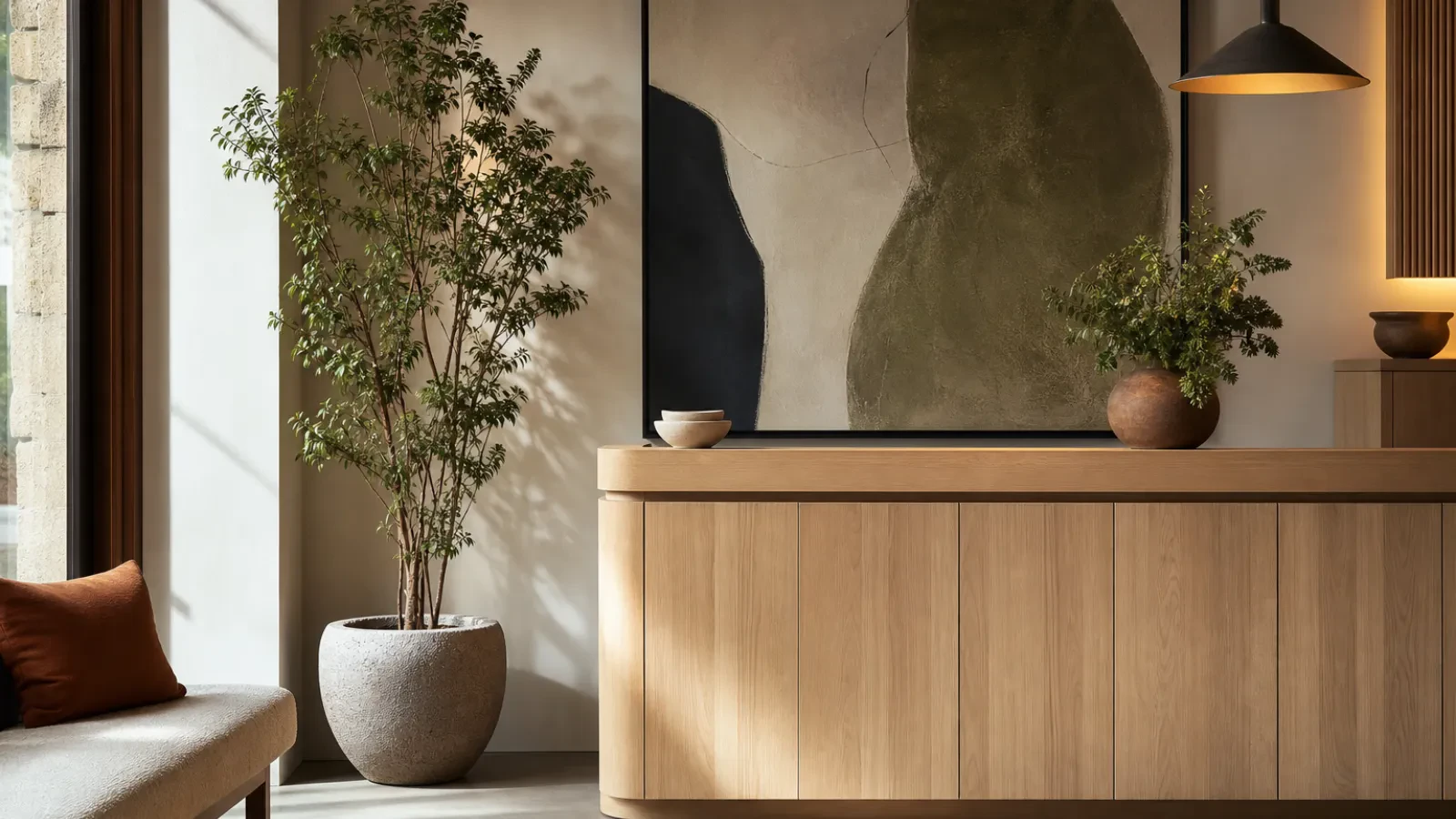
Reception Ready: How the Right Wall Art Shapes First Impressions
Your visitors start forming a view of your business before anyone has said hello. They notice the light, the seating, the smell of coffee, and the walls. Reception is where people wait, so they have time to look, and what they look at tells them something about how you work.
Art is the easiest part of that to get right, because you choose it. Here is how to approach it.
Decide how people should feel
Before you look at a single print, write down what you want a visitor to feel while they wait. Calm and reassured? Curious? Welcomed? Energised? A solicitor's office and a design studio want different answers, and the answer will guide everything else: subject, colour and scale.
If you are unsure, think about the last time you waited somewhere and enjoyed it. Chances are the room felt unhurried and looked after.
Let the subject say something about you
A reception wall works hardest when the art quietly relates to what you do, without being literal.
- A technology or engineering firm might suit Graphic & Geometric pieces, with clean lines and a sense of order.
- A clinic, therapy room or spa often feels right with Landscapes & Nature or Botanical & Floral work, which tends to slow a room down.
- A creative agency can be more adventurous with Abstract compositions that give people something to talk about.
- A professional services firm that wants to look composed might lean towards Minimalist pieces with plenty of space around them.
None of these are rules. They are starting points. The test is simple: would a first-time visitor feel that this picture belongs in this room?
Go larger than feels comfortable
Reception walls are usually bigger than people expect, and small frames get lost on them. A single large piece, or a pair hung with an even gap, looks more confident than a scatter of little ones. As a rough guide, the artwork should fill around two thirds of the width of the furniture or wall space beneath it.
Hang it lower than you would in a corridor. Visitors are mostly seated, so the centre of the piece should sit around 145 to 150cm from the floor, which suits both seated and standing eye lines. You can compare formats and sizes on our sizes and pricing page.
Choose a finish that suits the room
Busy receptions get knocked about. Framed prints give a polished, traditional look and protect the surface. Stretched canvas is lighter and works well in softer, more relaxed spaces. Whichever you pick, think about where daylight falls on the wall before you order.
Use colour to support the mood
Rather than reaching for a formula, look at what is already in the room: the floor, the seating, your logo. Pick art that shares one or two of those colours and adds a third. Deep blues and greens feel settled, warm earthy tones feel friendly, and a neutral palette lets your staff and signage do the talking. If you already have a palette in mind, you can browse by colour, for example teal.
Keep it simple, and keep it looking good
One or two well-chosen pieces nearly always beat a crowded wall. Whatever you hang, give it good lighting and wipe the frame down now and then. Dusty or crooked art sends the opposite message to the one you intended.
Where to go from here
Walk into your own reception as though it were your first visit, and ask what the wall is telling you. If the answer is "nothing much", that is an easy thing to fix. You can start with our art for business and commercial spaces, or, if you need several pieces to work together across a building, take a look at our trade service.